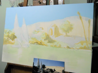
I've noticed that in the preliminary stages of a painting's life, it never looks very good. In fact, it often looks like complete shit. But the objective in the beginning stages of a painting is not to make it look good, but rather to map out what is important in your piece. For example, this painting was started yesterday. I mapped out where the shapes and lines would be, where the darkest values would fall, and the color palette:
Memo:
Triadic color scheme...
1. Shadow and Sky: 2:1 Dioxazine Purple and Pthalo Blue
2. Irony Soil: 3:1:1 Burnt Sienna, Cadmium Red, Pyrrole Orange
3. Foliage: Chromium Oxide Green (dulled down with a dab of #2)
Elephant painted with: Titanium white plus #1 and #2
finding my creative spirit
Monday, October 8, 2012
Sunday, September 16, 2012
Thursday, September 6, 2012
Commission-- getting closer
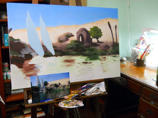
Seeing a photograph of my progress only seems to make me realize all the little things I still need to fix. The reflections in the water are really giving me problems-- I've never done a painting with waves like this before so it's kind of a learn-as-you-go type of ordeal... Definitely need to lighten some areas up. The rocks and grass on the bank look better, but they still need more definition... I also need to fix the sail on the smaller boat, because the mast is obviously crooked and it bugs me. But it looks more complete than it did yesterday so that helps.
Here are the four photos of my progress thus far, side by side, for comparison.
Tuesday, September 4, 2012
Commission Progress
Started work on the water today-- waves are a bitch, but I'm starting to get the hang of it! :D
Monday, August 27, 2012
More Derping Around
Friday, August 24, 2012
Ooooh LAYERS!!!
Just downloaded paint.net which is a free, watered down version of photoshop, but easier to use and fun. I've been playing around with adding texture layers to make my sketches look a little less blaaah. :)
On this one I added a paper bag texture and lightened the inside of the sketch to make it stand out more :)
Wednesday, August 8, 2012
Aztec
We took the students on a field trip to the raptor center and since the handler requested we not take pictures of the owl (in case the flash accidentally went off-- she is easily spooked) one of the little boys asked me to draw a picture of her. This is Aztec the spectacled owl. :-)
Subscribe to:
Comments (Atom)


